The lessons we teach our clients aren’t just key phrases we throw at them until change happens, they’re values and strategies that we wholeheartedly believe in and apply to our own brand. So when we realized that 20Degrees Media’s message wasn’t getting across as it should have, we decided to implement a complete rebranding; including logos, colors, and typography. Let’s walk you through what changed, and more importantly, why we decided to change it!
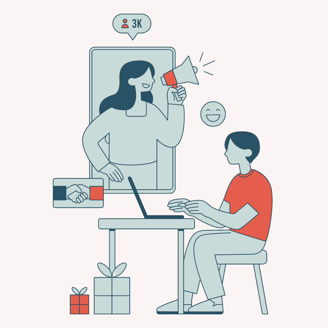
Over the years, our brand has evolved, particularly in the services we provide and what areas we specialize in. Before, we focused on photography and creating visual content for the businesses we worked with. Whereas now, we’ve shifted over to helping business owners create strategy plans and make data-driven decisions. While we still offer photography, we wanted to highlight our main service and help make sure that all of our potential clients understand what it is that we’re offering. Something that’s gone unchanged, however, is that our clients are still in the outdoor, wellness, and e-commerce space.
An issue we were running into, though, was finding a clear way to explain this. We were struggling with getting it across that we’re a brand that councils other businesses using data, but that we primarily work with those in the outdoors market. If we were working with another brand going through a similar issue, we’d most likely suggest the same process we undertook, a rebranding!
If you’ve been following us for some time or have checked out our previous website, you’d see that we had uniformity in our logo, colors, and typography. Still, in order to make our message clearer to our audience, we made changes to each aspect. Our past logo, in particular, gave off a very professional tone, as we intended it to, but it didn’t do much in the way of conveying what fields we worked best in. Our new logo is simple and clean while also having a sense of nostalgia. The line work in particular is supposed to represent the lines found in graphs and charts, reflecting our focus on helping brands with their data.
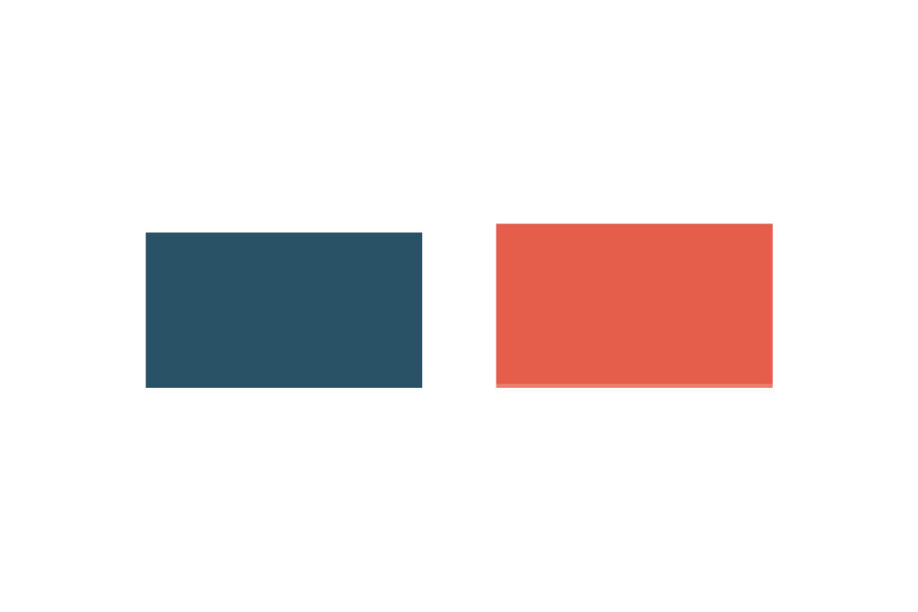
Previously, our brand colors were on the brighter side, which we loved, but they needed a bit of refining to the overall feel. We kept a few of the colors that we really identified with in nature and then used those to select thoughtful complementary colors.
The typography, in our logo especially, does a lot in the way of emphasizing the traits we wanted our audience to focus on. Our amazing brand partner that we worked with for this process put a lot of thought into our fonts, wanting its style to be reminiscent of the lines and curves found in nature.
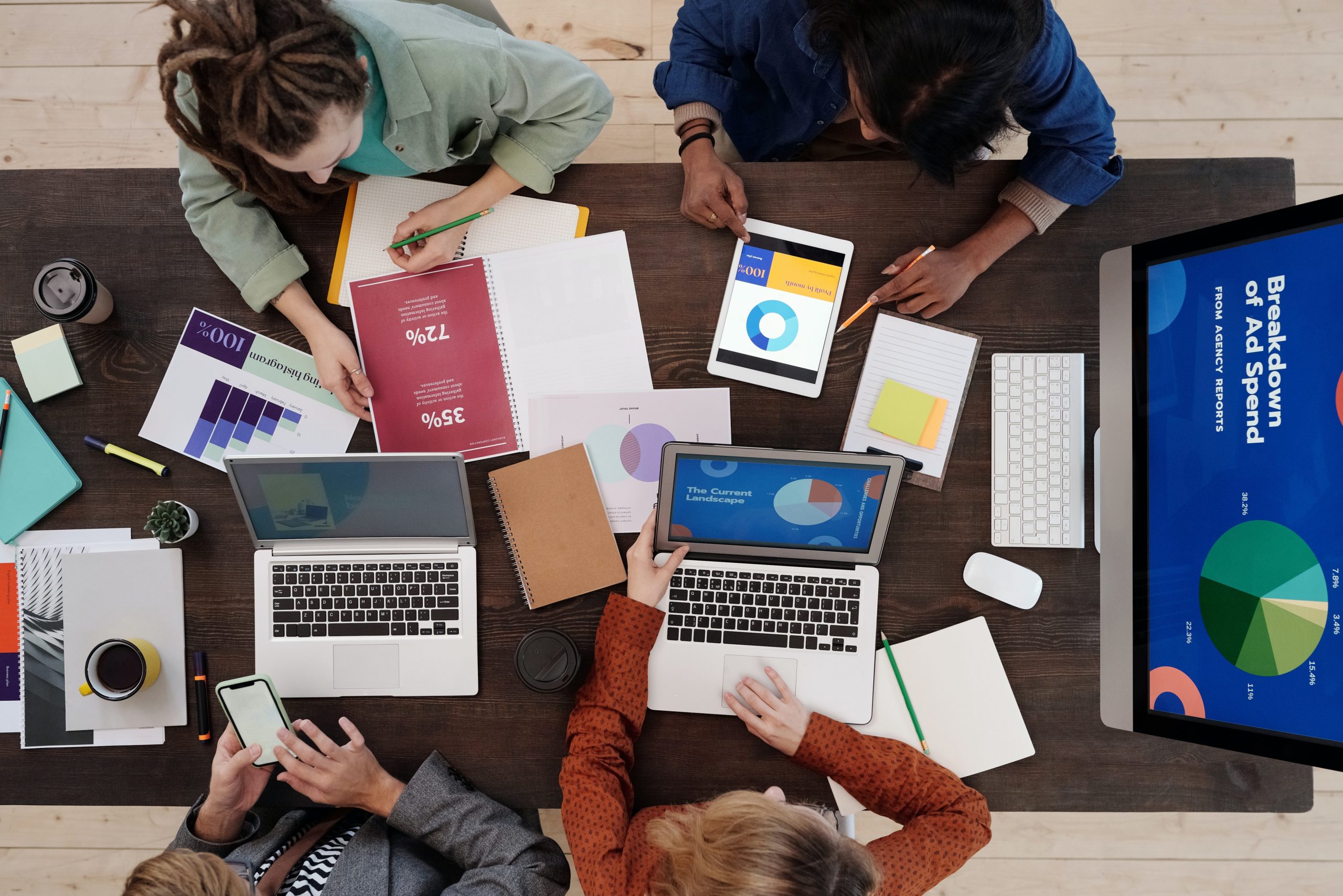
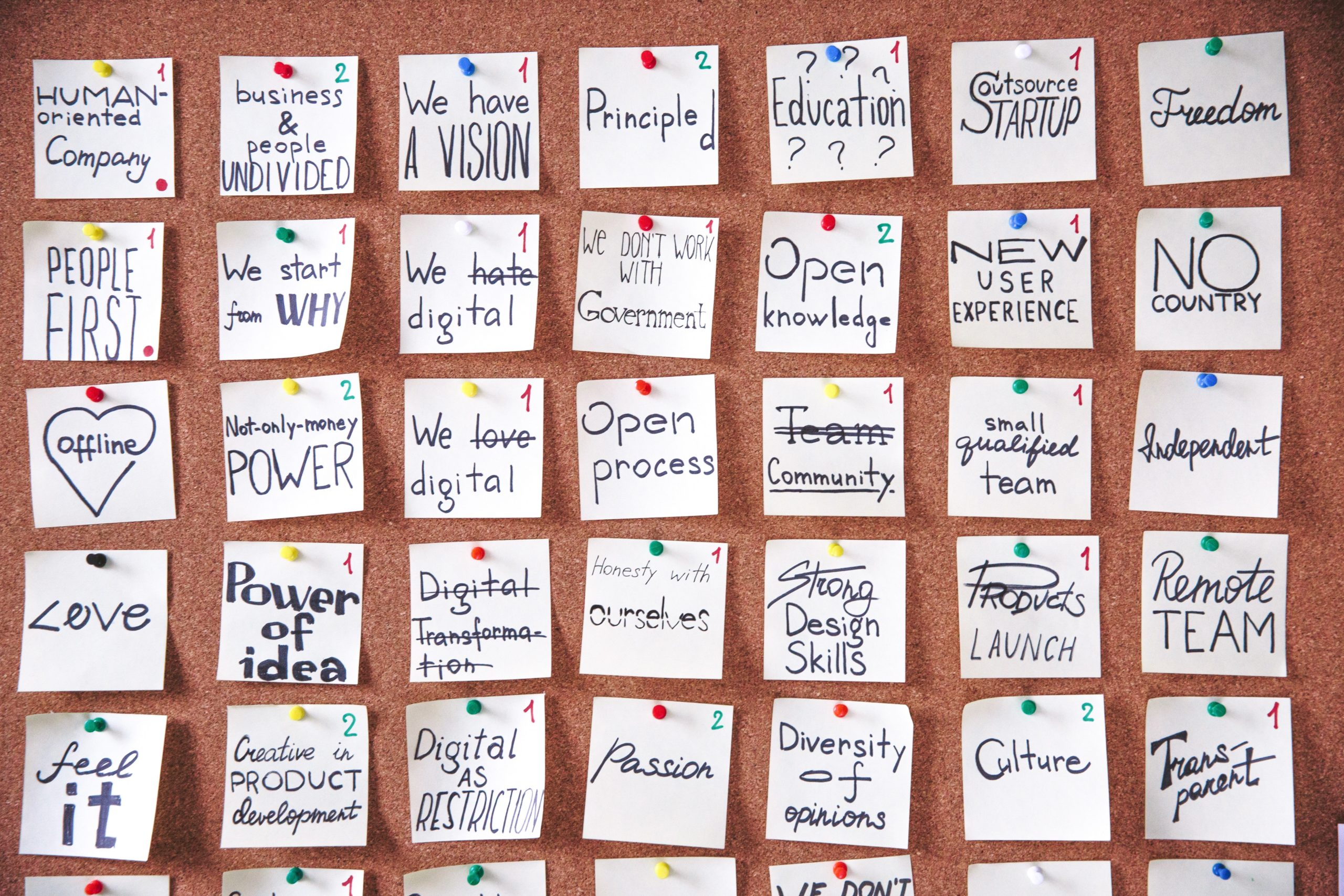
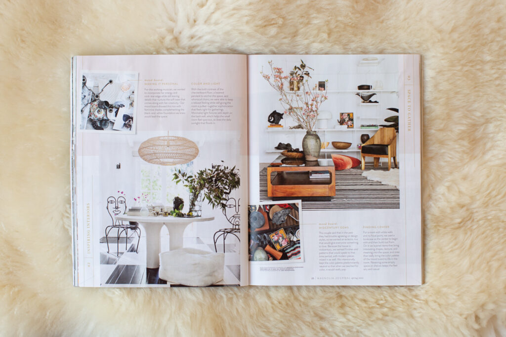
When consulting other business owners, we like to start by creating a “mood board” with them. It helps to give us an idea of what the core of their business is, and what they want their customers to feel like when they meet with them. The most recent issue of Magnolia magazine did a highlight on how a stylist and a lifestyle photographer approached a mood board together. The photographs chosen became the compass to their interior design elements – what’s put into a space and how it’s supposed to make one feel.
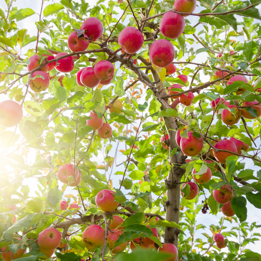
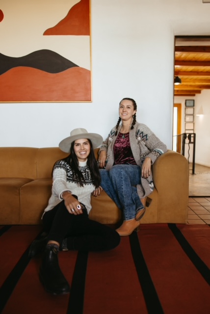
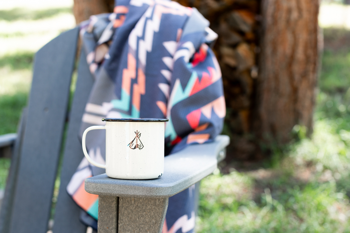
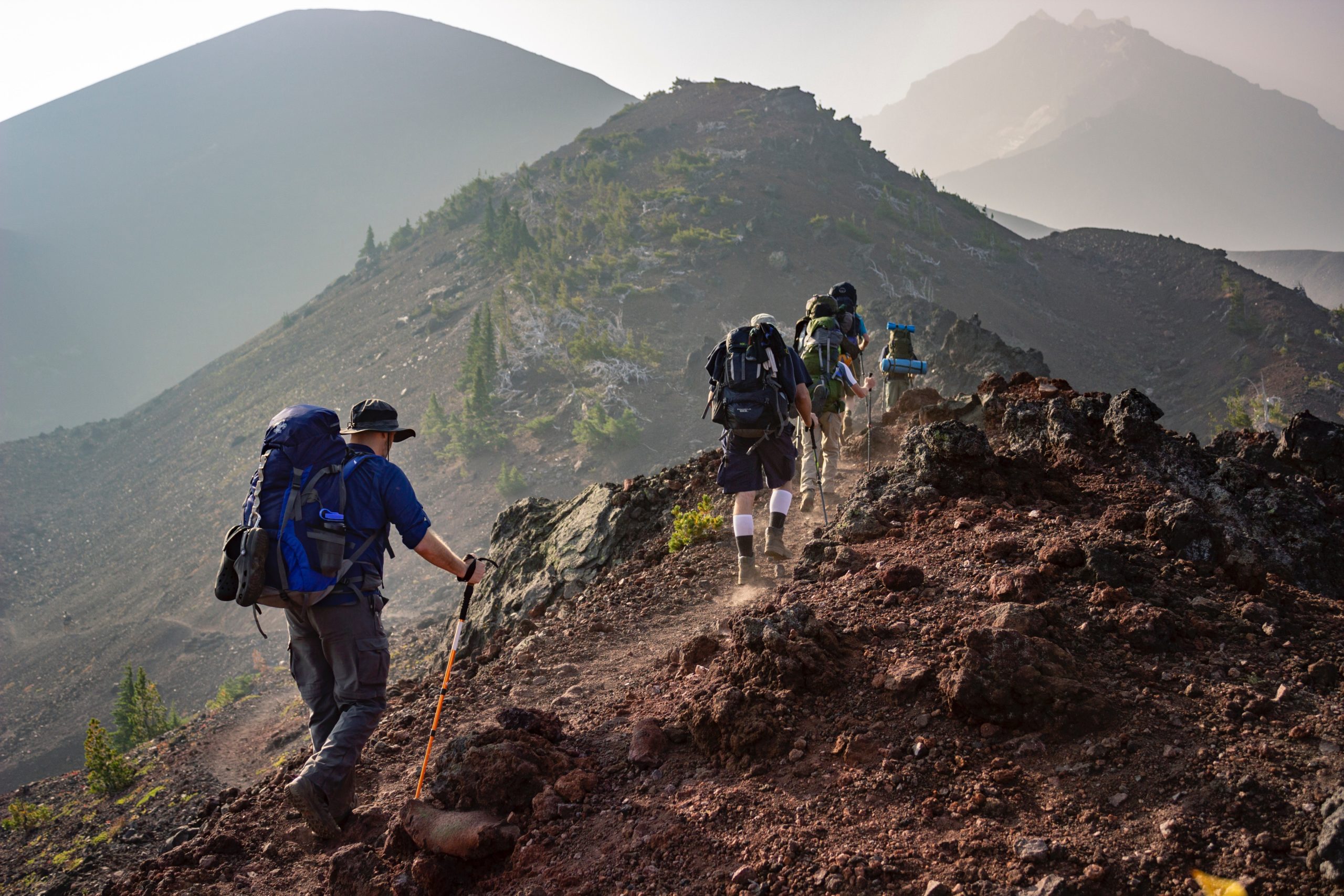
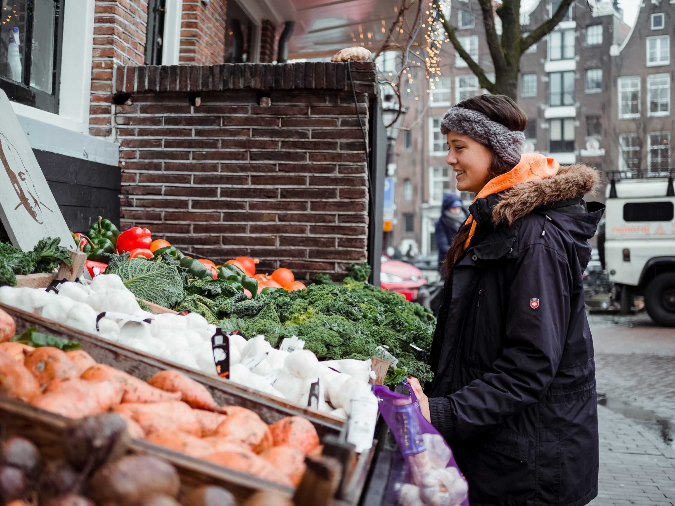
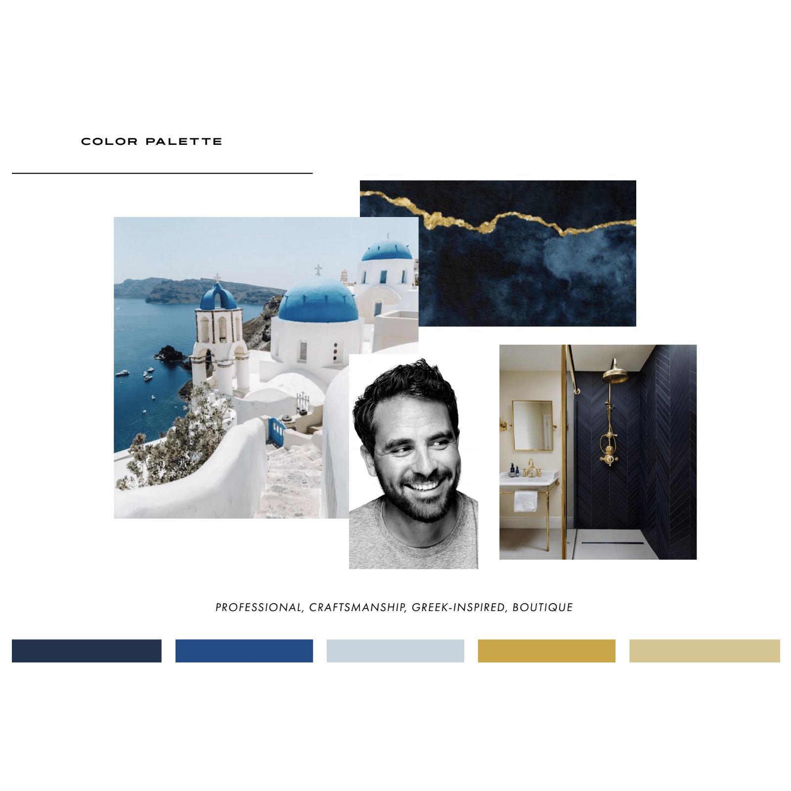
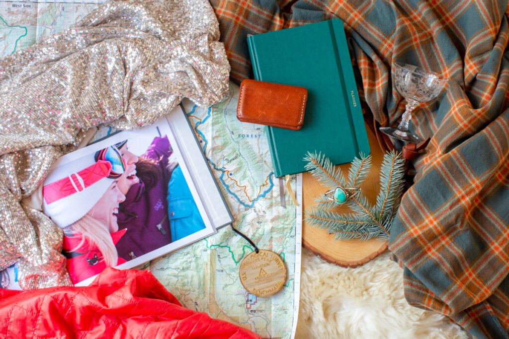
This is our own version of a mood board. We want our clients to feel comfortable sharing with us what they’re struggling with so that we can get to work on providing solutions. We want a well-thought-out plan that considers all the details and a roadmap to see a project to completion that leaves a lasting impact for growth. We’re calm in nature and we want to celebrate with you when you cross that finish line!
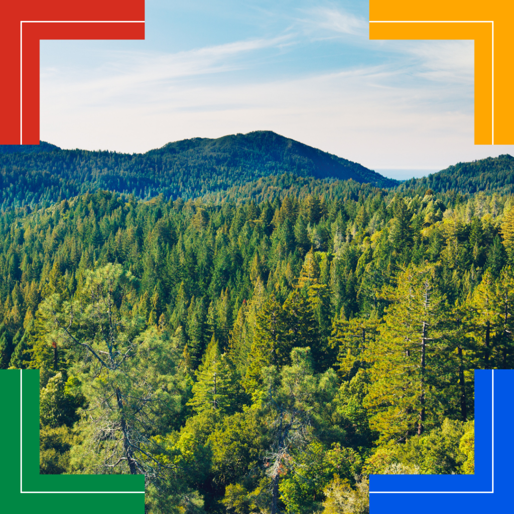
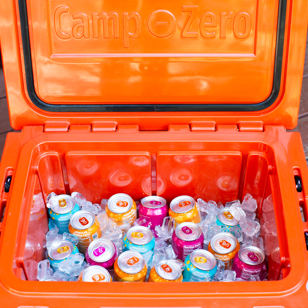
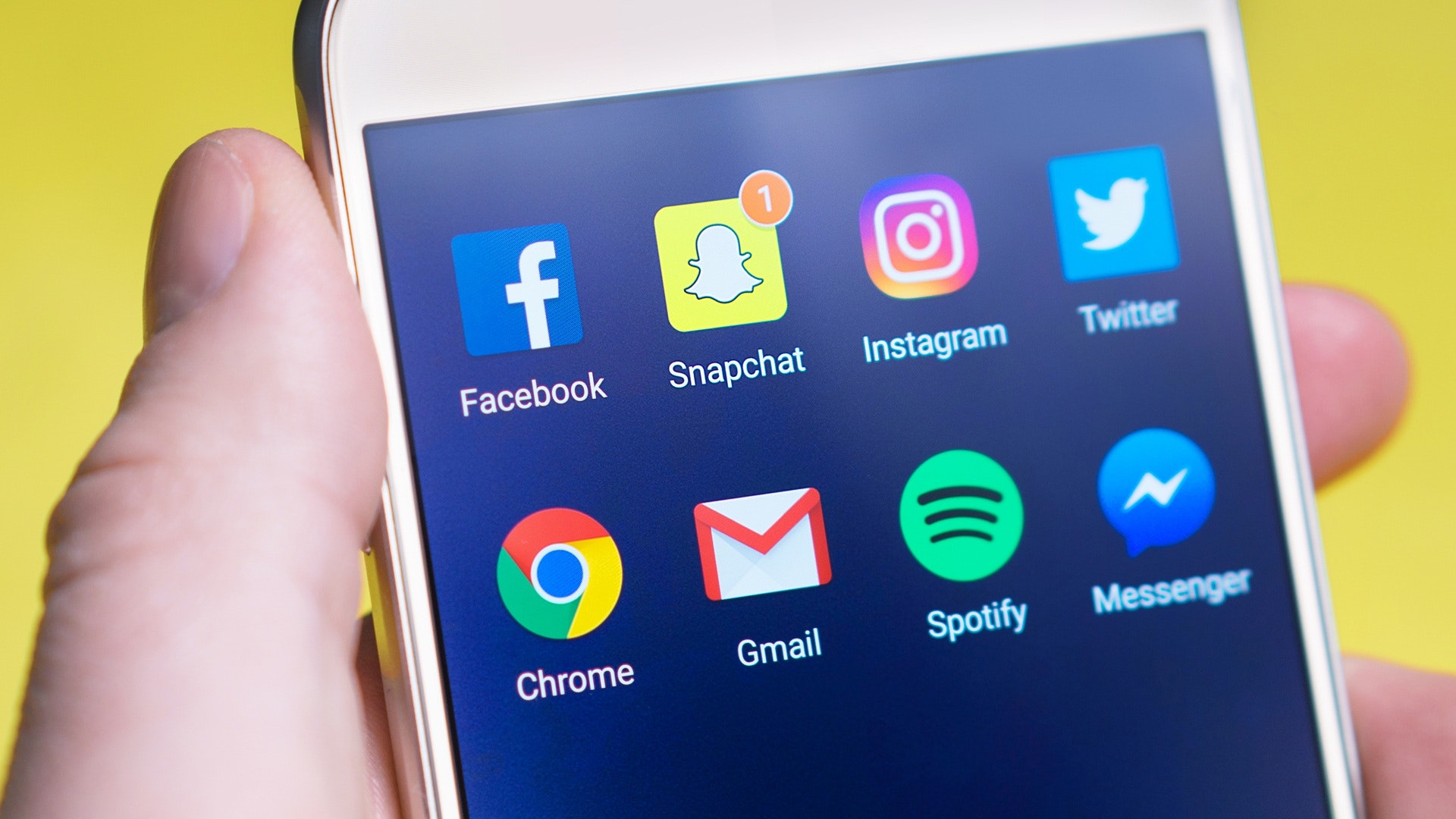
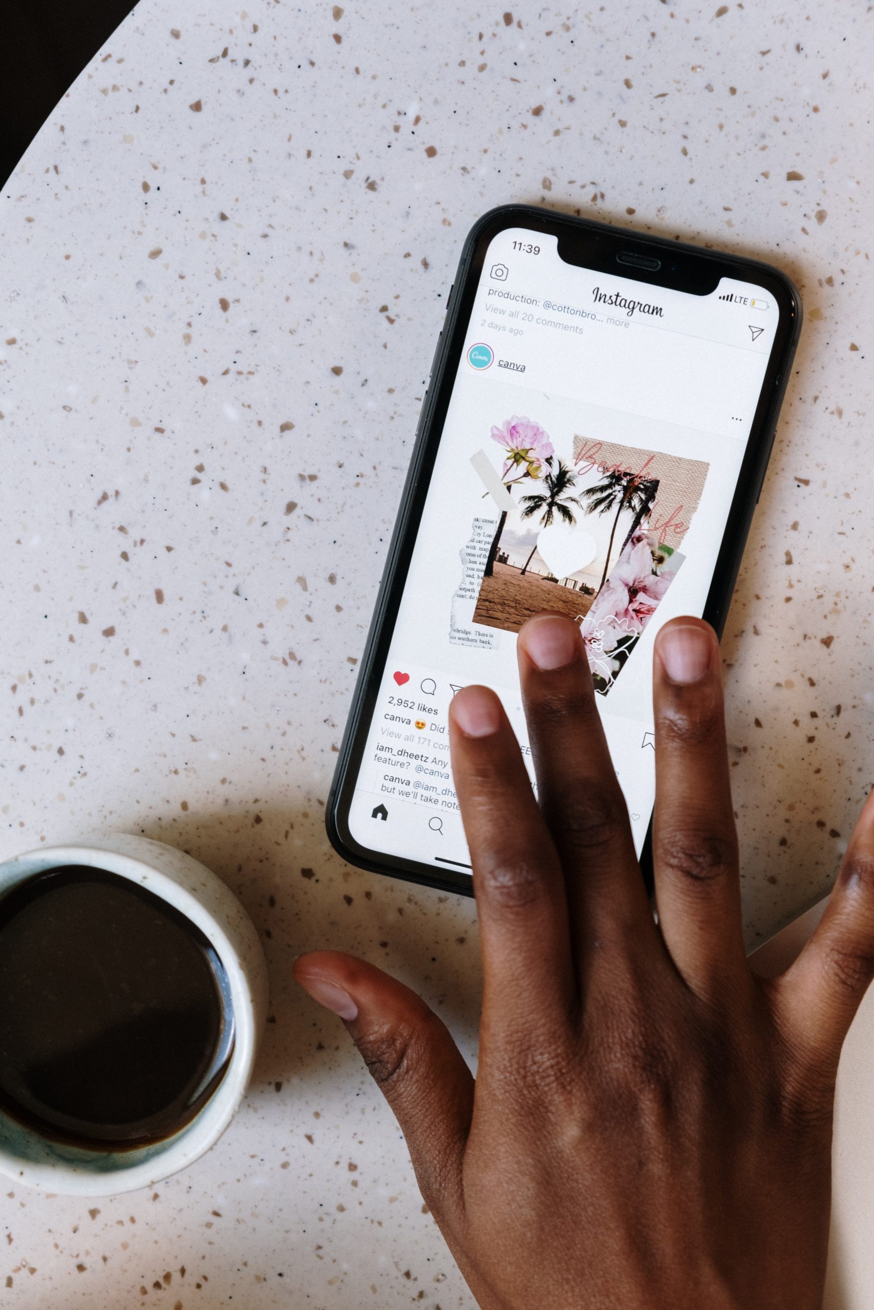
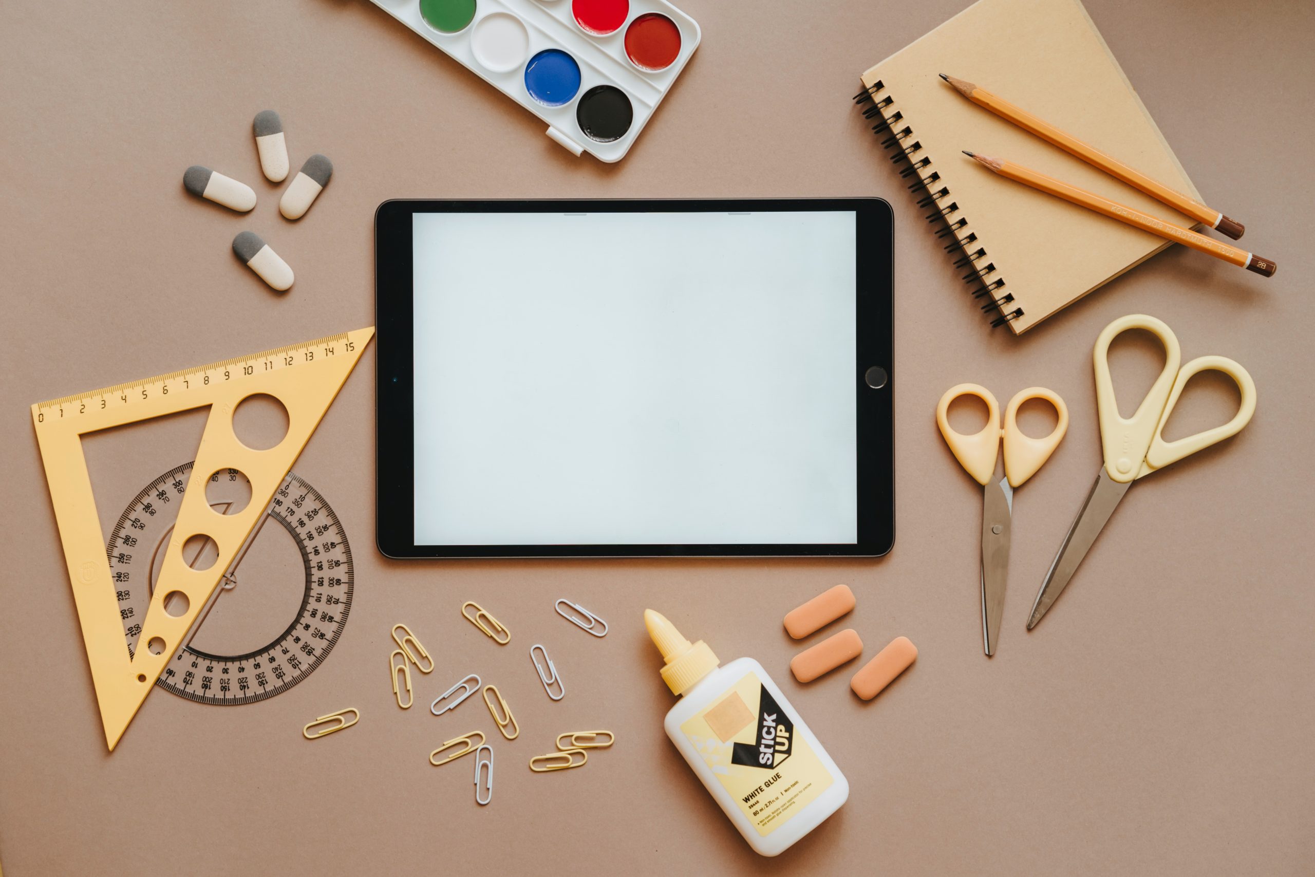
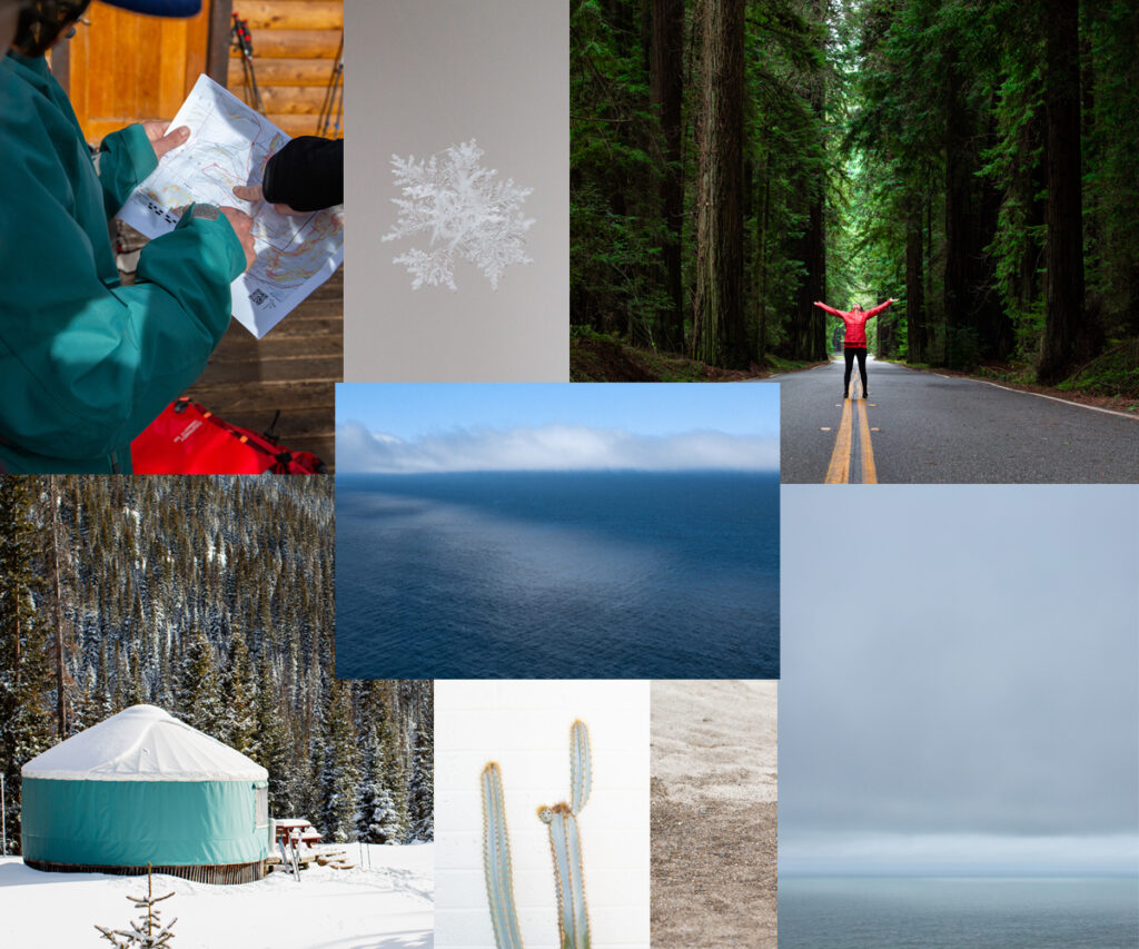
Here’s a second mood board that takes into account the role of photography in our brand moving forward.
We often like to reflect on our own struggles and think about what we did as a brand to overcome them. By doing this, we’re able to give advice based on first-hand experience you may not find elsewhere. After realizing that our message wasn’t coming off as intended, we knew it was time to make a change and revamp our look to reflect what we were verbally saying and to now visually say it. We couldn’t be more excited to share the new 20Degrees Media rebrand with you all! We are working on the complete update – it takes time as all good things do:)